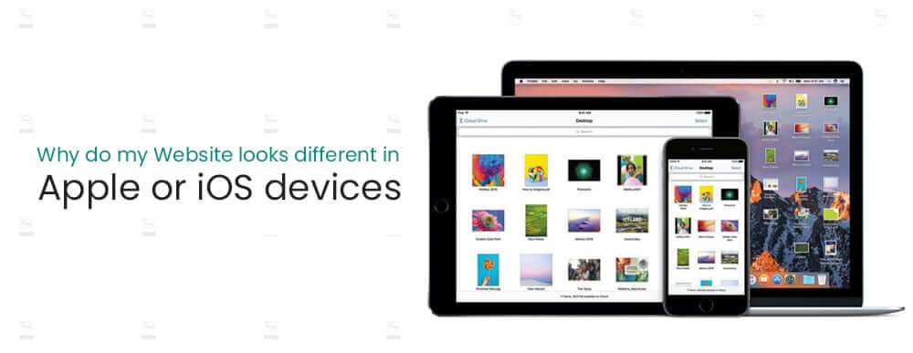
Why do my website looks different in Apple or iOS devices? This is a very common question web developers and designers are facing in the web development industry in Dubai, UAE. Well! Though this question may look simple it isn’t. Keeping in mind that there are different operating system with different browsers, and each operating system has different updated versions of each browser, not only that, different types of devices such as smartphones, tablets, laptops with different screen sizes, the cross-browser or cross-platform compatibility could be a nightmare for a web developer. The customers most often test the websites on 3 to 5 different devices, with mostly two to three different browsers, but for a web designer or web developer, the best approach is to test a website in as many different devices as possible.
This blog could be a bit technical but I will try to keep it as simple as possible for a common reader. Here is some common reason that your website may look different on different devices:
Operating System Compatibility
For instance, let us take the example of Safari browser, the latest update of Safari browser on windows is Version 5.1 whereas for MAC the latest update is Version 14.0. This even further increases the complexity, your website may look great on Safari running in Windows operating system but it may look distorted, or doesn’t look as it should be on Safari running in MAC operating system. Same applies to other browsers too for different operating systems. That is not all, another thing with version compatibility is let say a particular update that enhances specifically the computing capability for JAVA Script, or CSS might be available in older versions of Safari for MAC and might not be available for newer versions of Safari for Windows.
Browser Compatibility
Apart from versions, when we are checking a website in different browsers the appearance may differ in different too. Let say for example if a website is appearing fine, and working completely well in Chrome and Opera, but it may show some issues in Firefox or in Microsoft Edge or Internet Explorer browser. The internet explorer browser is discontinued and got replaced with latest Microsoft Edge browsers but still, you will notice some people are using the IE, especially in offices in Dubai, UAE. So, this could be another issue which results in your website appearing differently in different browsers.
Programming/Coding Language Versions
Programming/coding language versions are also very important if you want to have cross-browser and cross-platform compatibility. For example, these days the modern websites are developed using CSS3 (modern CSS version) and HTML5 (modern HTML version). These two are the major components of the modern web site’s user interface or front end, JAVA, JQuery, AJAX, etc and a few many more are also part of an interactive web design and the coder and programmer in Dubai, UAE love to use them for better user experience. Sometimes the web developer and UX/UI designers literally push the limits to achieve their looks and feels. Some browsers are quicker than others to adapt to such technologies, and some are not, not only that, the same browser in the different operating system may not support what it is already supporting in another operating system. This could also lead to a distorted website layout or simply it can cause a lot of compatibility issues.
Bulky Codes or Unused Codes
Another mistake that we found very common among the web designers and developers in Dubai, UAE is that they love to reuse the codes and chunks of the codes from their previous projects, this could also lead to a bulky file for a browser to execute, which could results in a lot many different issues, and it also makes the debugging even harder. I am not saying that one should never reuse their codes, what I am saying is that if you are using a CSS, HTML or JAVA Script from your previous project or from a code repository, then use them wisely and try to remove all unused or irrelevant codes from your front-end files. This will not only reduce the bugs and errors but it will also make the debugging easier.
Smartphone Compatibility or Responsive Web Designs
No web design is accepted these days which doesn’t come with smartphone compatibility, this is what we called responsive web designs. The responsive web designs have their own set of problems and issues. First of all, there are different operating systems such as Android and Apple iOS. The other major problem is there are tens of hundreds of different screen sizes. As time is passing the mobile phones are evolving rapidly, sometimes offering a technology which isn’t even available in the desktops or laptops. So we will be going to elaborate all compatibility issues with smartphones in details:
Smartphones Operating Systems
Majorly the market is occupied with two operating systems, Android by Google, and iOS by Apple. These two are completely different technologies. Not only that, the mobile phones market has the most frequent updates than any other IT technology. This also means there could be hundreds or thousands of different operating system versions running in the market. The smartphone eco-system is developed in a way that it always consider the older devices while preparing for a newer one, but there are tons of new devices with a variety of different operating system version running on them.
Smartphone Browsers
Same like desktops and laptops the smartphones to have different browsers, for example, the most popular browsers for iPhone or iOS users is Safari and for Android users, Google Chrome is the preference. This also means that each website should be able to be completely compatible with these different browsers.
Smartphone Screen Sizes
Another big problem with modern websites is to cope with a huge list of different smartphone screen sizes. Not only that let say if two smartphones have the same physical size let say 5inch but the screen resolution could be entirely different. These things even make it harder to troubleshoot layout and especially text related issues in smartphones.
Tablets
Both Android and Apple Manufacturers have a variety of different tablets, and as most of the tablets support a full desktop-like layout, which has to be optimized for the smaller screen as well to support tablet devices. Again with a tablet, the operating system, browsers and versions, related issues are still there. So, the website should have to offer a variety of different cross-platform, cross-browser and screen resolution compatibilities.
Conclusion
Why do my website looks different in Apple or iOS devices? Like I said the answer to that question is not a simple one. The best way if to work with a framework platform such as bootstrap, even then the web designer and web developer should test the website on as many physical devices as possible. Do the coding with a minimalist approach, and include alternate codes for all possible browsers, operating systems, screen sizes and versions. This is the only way to provide a universal user experience for all devices and platforms. Creating responsive websites is not an easy task and it is getting harder day by day, by the inclusion of more devices, versions, screen sizes and higher demands of interactive user interfaces. The web designing agency in Dubai, UAE has to be capable of dealing with all those technologies.


