In this blog, we will discuss the impacts of touch screens on web design. Well, touch screens have completely revolutionized our daily lives. Nowadays the touch screens are everywhere and are far more incorporated in our daily lives than ever before. The web design industry is also growing and adapting to new technologies, the touch screens and smartphones are one of them. The websites are very important for a business, as most of the times people will look up on the internet for a business before making a purchase decision which makes the websites even more important. That is not all, whenever someone needs something they search on the internet, it is very common. Which is why business is getting a huge chunk of their sales either directly or indirectly from the internet. The brand identity of any business or organization is heavily influenced by its website online presence and the website is the centre point of that online presence. The success of a website is depending upon two major factors, one is the layout of the web page and the second is customer experience.
See More: 5 Latest Trends of Websites in Dubai
Here are 5 Impacts of the touch screen devices on web design:
1. Web Design’s Layout and Presentation
The web design behaves differently on different touch screen sizes, we usually called refer to this phenomenon as “responsive web design”. Responsive web designs are programmed in a way that they can sense the screen size and device from which they are being accessed. Then the responsive web design automatically renders their design elements and information in a fashion which is most appropriate for that particular screen size. This all is to ensure the finest user experience and all this happens within a fraction of a second and a human being cannot even notice this all. The overall web design layout is made up of different design elements, for example, the images, photos, text, headings, boxes, buttons, navigation and such things, which present the information in a useful manner for the users.
When a responsive web design is opened at different screen sizes it behaves differently, the objective here is to maintain an almost similar user experience on different screen sizes, for example, if you are accessing a website from a 14 Inch laptop screen you know the purchase button is located on the lower right corner of the product description. So when you are opening this website from your mobile phone which has a 5.5-inch screen you will surely go to expect that button just below the description, this is how the human brain works. And this is what a responsive design should do. Although the overall presentation of the information is changed still are able to meet the expectations of your visitor, this is how the responsive web designs are programmed.
See More: Importance of Web Design in 2021 in Dubai, UAE
2. Web Design Navigation Structure
The navigation structure is very important for any web design. The navigation structure is all the information are presented and provided on the website. Most of the time all the important things are placed in different places, for example in the first landing screen is the first visual interaction of a user, it mainly consists of an image slider with multiple important products or services along with appealing sales pitches. The second landing screen is when a user scrolls down and view the next section of the web design, it mostly contains more products/services or sales pitches or a short introduction of the business. Then there are more until the bottom or footer of the web design. On top of the web design, there is always a menu, which provides links to the internal pages and more information. This is how a full navigational structure of a web design is built.
When we open a website on a smartphone or smaller device, the menu cannot be displayed in its entirety as we can display it on the desktop or laptop computer screens that are bigger. So, in order to provide the menu most of the responsive designs display a button or icon of the menu, when a user tap on that menu the menu appears in vertical or nested or tree shape to let the user navigate through all of the information from the internal pages. This is how the navigation is reshaped for the touch screens. Now the most important thing here to consider is that the user might be touching the screen with a finger or thumb, so the size of the buttons and the size of the menu items should be enough to compensate for the effect of tapping with a large thumb of a finger. If the buttons are too small or the menu items are too many and have to be small to be displayed in a single screen view, then the user might accidentally tap on the wrong item/button. This will be very annoying and the user might not consider going any further if they are unable to easily tap the item/button they wanted to.
See More: 5 Facts of Productive Web Designs – Dubai, UAE
3. Hover Effects, Touch Sensitivity and Invisible Content
One of the biggest disadvantages of touchscreens is that they do not support hover effects. So, if your web design is heavily relying on hover effects and the information especially the navigations and menus are designed for the hovering effect, then immediately fix them. This could lead to a lot of problems when a user is viewing your website from a smartphone or any other touch device. Another problem with the touch devices is that there is a latency in some touchscreens, mostly it is 300ms which although doesn’t look much but when special effects are used on your web designs this factor could cause issues in the touch screen user experience. There are certain devices that support 3D Touch or a multi-dimensional touch which basically work differently on different levels of pressure, but these devices are very rare and the website development technologies don’t have enough support for these too. Such features are usually designed for smartphone applications rather than web browsers.
A huge concern related to user experience is the invisible content, like smartphones and most of the other touch screen devices are smaller than the usual computers and laptops this is why the web designs are programmed to hide certain aspects of the designs, graphic elements, and sometimes information too. Which could ruin your user experience. Most of the times the web designers program a responsive web design to hide the sidebars or widgets in the side column of the web design which is very bad for the user experience. The users and customers always expect the same navigations, structure, behaviour and information of a website on the smartphone and tablets as well as they are on the desktop and laptops. So, all the content and information available on a normal desktop or laptop version of the web design should also be provided in the smartphone or touch screen version too.
See More: Limitations in web designs for E-Commerce websites
4. Compatibility and Load Time
Compatibility and load time are very important not only for the users but for digital marketing too especially for search engine optimization (SEO). These days the modern web designs heavily rely on design elements, rich graphics and multimedia content rather than textual content so the compatibility and load time could be a nightmare for the web designer and web developers. Nowadays, touch screens are not only smartphones and tablets, but laptops are also adopting the technology and smart screens are dominating the TV industry. You don’t know if your user is coming from a smartphone, tablet, smart TV or smart media box (almost all smart media box/player support web browsing). All those touch screens enabled devices are built on different technologies, with different application priorities and also with different computing powers.

This rise the importance of compatibility and load time. Smartphones and smart devices are comparatively weak in computing power compared to a regular desktop or laptop computer. Which could cause a longer load time on such devices. Sometimes the load time of modern web designs could be so long that a user quit on it and skip the website. This could be disastrous. Another important thing to consider is the compatibility as all touch screen enabled devices are built on different hardware and software technologies, their compatibility and behaviour towards different web design technologies are different. For example, the iPhones and iPads are running on iOS and most iOS users prefer the Safari web browser. Similarly, the Android Smartphone and Tablets are running on Android OS and most Android users prefer Google Chrome and Firefox browsers.
See More: 5 Different Phases of Web Design and Development Project
All the browsers such as Google Chrome, Mozilla Firefox, Safari and Others are built of different technologies and all the platforms or operating systems such as Android, iOS, Windows, Linux and others are also built on different technologies. For example, the Safari browser may behave differently on Windows than on iOS or MAC. The same applies to all other browsers. This causes a huge difference when it comes to user experience and how your web design, its content and its response will be on different browsers and on different platforms. So, a web design must have to be able to deal with all those technological differences to ensure the maximum user experience.
5. User Interaction with Mobile First and Desktop First Web Design
The user interaction with Desktop First or Mobile Fist web design is a very long debate among the web designing community. Most of the time the web designers carefully analyze the audience and estimate the web traffic source either it will be the desktop or laptop devices or smartphones and then make a decision. Which was somehow correct in the past but not anymore. Nowadays, the preferences of the people are changed. People are spending more time on mobiles than on computers. Still taking a decision between desktop-first web design approach and mobile-first web design approach could be tricky. As per my experience in the industry nowadays the mobile-first web designs are performing better than the desktop first web designs. As most of the users are spending more time browsing and surfing on smartphone devices so they are more familiar with the smartphone versions of websites and smartphone applications that carry a certain theme and design style. If your website is mobile friendly and is designed with the preference of mobile devices and touch screens in mind then the chances are they will also perform well on the desktop and laptop as well.
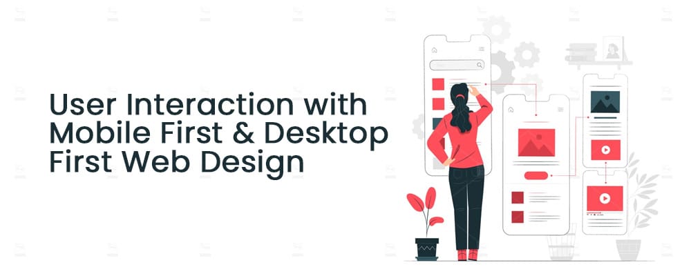
However, there is a huge difference between the desktop first web design approach and the mobile-first web design approach. The desktop websites are designed on a pre-defined structure which is 2 column or 3 columns or 4 column design. Whereas the mobile-first web designs are built on a modular structure, mostly box type design. The design is made up of different sizes of boxes, sometimes the boxes are visible and distinguishable and sometimes they are not. These boxes will allow the web designer to easily program them to fit and align according to the mobile touch screens, the buttons are also designed bigger to support touch screens and the key functions are placed on certain places which are easy to tap from the smartphones. The page scrolling can also be configured to enhance the mobile user experience. Most of the graphics and effects are achieved through CSS/programming to ensure quick load time on mobile devices. This is the major difference between the desktop first web design approach and the mobile-first web design approach.
See More: What kind of Web Design Compels Customers to Click Call to Action?
Conclusion
The touch screens are heavily impacting the web design trends and the user’s expectations. It is very crucial for the success of a web design that it maintains a similar user experience in any version of the website whether it is accessed from a desktop/laptop or smartphone or tablet the users should be able to easily identify and reach the important information and navigation. The load time and other programming limitations that are present in the touch screen enabled devices should also be considered and accounted for while designing a website. As we know that in general people are spending more time searching and surfing the internet from touch screen enabled devices so our web design must have to design to provide the ultimate user experience there. When we are designing the information and navigational structure of a web page for the touch screens, we can easily map it on the non-touch devices such as laptop and desktops, but if our design approach is desktop first, it could get harder to maintain a similar user experience on the touch screen enabled devices.
At RSI Concepts we have vast experience in web designing and development, our clientele expands from small local business websites to huge corporate sites and everything in between. If you need a business website, or corporate website or eCommerce or an online marketplace, feel free to reach us out using the below comment box or contact us through our Contact Us page.
Check out this: 6 Step guide to choose a web design firm in UAE
